Paul Klee, artist, 1879-1940, Swiss.
"Primitive art, surrealism, cubism, and children's art all seem blended into his small-scale, delicate paintings, watercolors, and drawings." (Web Museum, Paris)
That is all that I want to say about Klee himself; his past childhood and adulthood do not interest me right now.
Meaning in art
There are two particular pieces of him that I enjoy. I don't think that the titles are too important, and I don't think that the factors that brought him to create these pieces are significant either. Being a "meaning" nihilist, I will take the perspective of no-meaning besides the physical piece of artworks themselves. The "meaning" behind these pieces are not important (right now). I do not like the little tags next to art that give/add significance to the piece; if the art is good enough, it doesn't need a paragraph to explain why it's special. For example, at a gallery showing John Lennon's artwork, I thought that the art took very little skill, I didn't think that they were good, but the little-pieces of paper next to each piece described the inspiration and meaning of the piece. Unless I'm considering the artist as a person, I don't care why an artist created a piece. Art has to be good enough to "stand on it's own", without the pointless labels that tell the viewer about the importance. Anyone can make up a meaning, but there are only a few pieces that are good enough as themselves.
I will critique two pieces by Paul Klee.
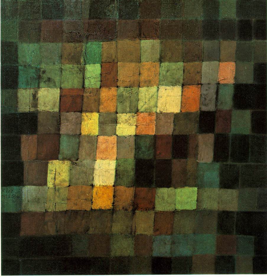
"Ancient Sound, Abstract On Black" 1925
http://www.sai.msu.su/wm/paint/auth/klee/klee.ancient-sound.jpg
This piece just cuts the dark in an unusual way with a tilted area/line of lightness, that contrasts the darkness. This contrast creates complexity. The lights and the darks mix, while all a similar range of hues. The greens turn to blacks, and the greens turns to browns then to yellows. Each block of color is rich, textures and hues. The organic-form of the grid is a human-element; it makes this piece easier to connect to. How can a person not connect to the imperfect, non-straight lines? This shows two things: that it was created by human, showing skill, and this shows a humanness that people connect to emotionally. And, the darkness almost creates a border; this shows control. This control is foiled/contrasted by the human-elements. The piece itself is done on a square canvas/paper/something; a square is perfect, all four sides the same, and people are attracted to perfect things. In effect, all of these techniques bring perfection and human-imperfections into one piece, so both parts can exhibit their "best" traits. This causes the viewer to be attracted to, and have an emotional response to this piece, because it is so human, and so perfect, and also well executed with its perfections and imperfections, so the viewer feels a complexity, including: attraction to perfection, attachment to the human-imperfections, comfort with the natural hues/colors, mix of emotions from either sight moving up or down (depending on if the viewer looks up or down the bright area/line), and the hues/colors themselves are rich that it grabs the viewer. I highly enjoy this piece. It does not feel pretentious, it does not have that cliche "human form" hidden in it; the piece feels understated, and I respect understatements. The piece is 15"15"; I'm not sure if I would prefer this as a smaller or bigger piece. My only criticism is that I'm not sure if some of the textures on the mid/top/left seems pretentious, otherwise, I wouldn't change anything.
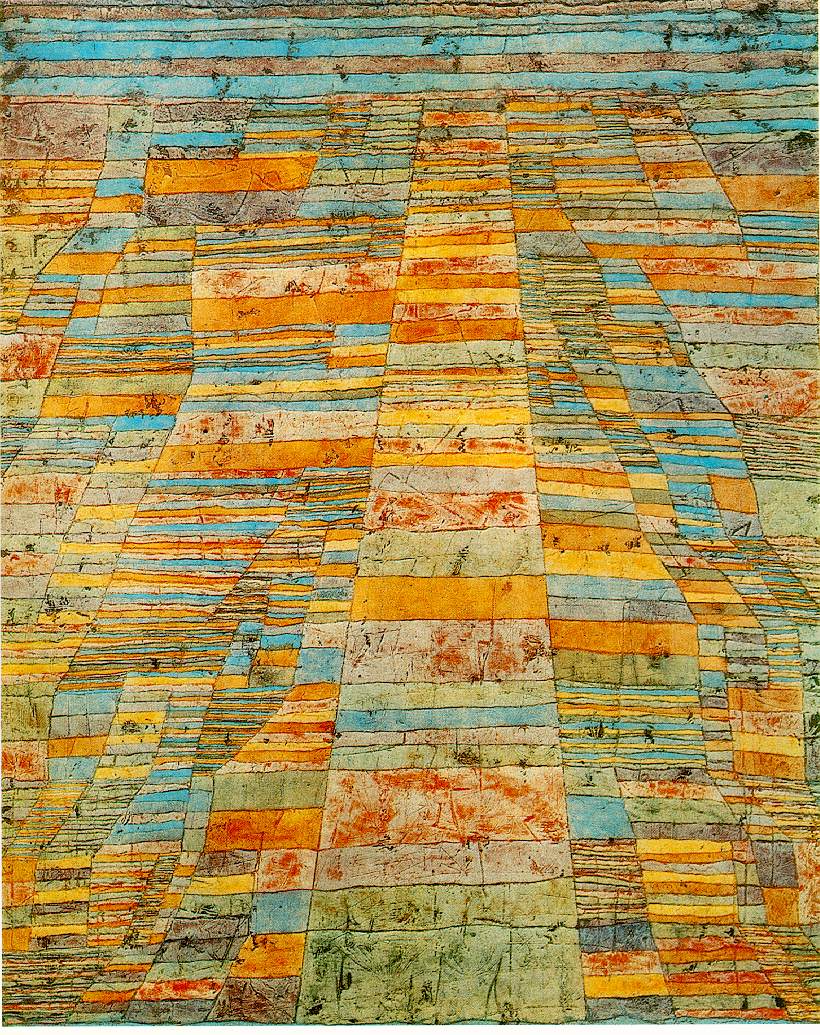
"Highway and Byways" 1929
http://www.sai.msu.su/wm/paint/auth/klee/klee.highway-byways.jpg
This piece is just pretty. I like to look at it. Again, there are human-imperfections, by the imperfect lines and coloring; this connects the viewer the piece. I feel that the dark splotches of colors (maybe where the canvas/something is dented) seems pretentious; I don't like that. I do not like things that intentionally creates imperfections (like French Country furniture with the white paint slightly sanded off). This type of intentional attempt at creating human-imperfections is dishonest. However, I don't know what Klee's intent was, and that isn't the point right now. The importance, is how the piece is to the me, the viewer, right now. I enjoy seeing those hues/colors; light-turquoise looks well with the reddish-orange, yellow, and opaque-green.. Also, the horizontal lines on the top give an unusual horizon-line. It looks tribal, human, with intents of design. It shoes rhythm (with the lines that the shapes form). The hues are fun and serious, or trust-worthy. It's not pretentious (except maybe the texture). I like this piece a little less than "Ancient Sound..."
Very interesting! I like those pieces, and I like your descriptions of them.
ReplyDeleteThanks :)
Delete