I am counting down the days. 3 more days of classes.
5 June - last day of school
10 June - graduation
12 June - go to Taiwan (tentative)
Yesterday, seniors got yearbooks (and other grades had to wait until today to receive them).
We haven't been doing anything in classes, except for math. Tomorrow, we have a calculus test in math, and I will turn in my last French packet in for extra credit. In art, we have a group project due next Tuesday. I have no motivation to work in school.
The art project is in a group of four. This is challenge #4. We must choose 2 inspirations from 4 choices: 2 from the ICA and 2 from the MFA.
5June-9June is marching practice, from 7:45 to about 11:00. I do not want to do marching practice because it's boring. I just want to graduate and receive my diploma.
I hope that graduation day is outdoors and that there is nice weather. But, right now, the forecast predicts cloudy/some-rain.
In Taiwan, I hope to spend some time at Nei-Le High School, travel different places in Taiwan to take pictures, practice dancing, and go grocery shopping in the farmers' markets in the morning.
On another level, I do not like to count-down. I think that each day should have an additive-quality, that each day gives, instead of counting-down each day, with every day considered as "in the way".
31 May 2012
22 May 2012
Good/Bad
I do not believe that there are bad people. Alternatively, I believe that there are good people. By "good", I mean, with beneficial intentions. Maybe it's a lie that I tell myself, for ignorance is bliss, but I don't think that this is it. I do believe that all people are good.
A common example might be: would Hitler be considered "bad"? While I don't consider his actions during the Holocaust "good", I don't believe that he was a "bad" person, though I consider his actions very "bad".
I prefer to be able to find harmony with all people. I don't think that a person can inherently be bad, or become bad. All things considered, this doesn't make me more trusting of people in general, nor does it mean that I like all people. It means that I do not see any person as "bad". This also means that I do not hate anyone. I dislike/disappointed/disgusted by many actions of people, but I don't hate anyone. No one is "bad" to me.
Done IB, sick, film
I finished all of my IB exams today, by taking two French SL exams. I am so relieved. I have no more major work for academics anymore. :)
I have been in physical pain today; my whole body hurts. This might be from the meningitis vaccination that I got yesterday. My arm, where I got the shot, hurts the most.
I will begin filming tomorrow, for my comedy/satire film titled "Spy Club". I am excited to begin filming.
I have been in physical pain today; my whole body hurts. This might be from the meningitis vaccination that I got yesterday. My arm, where I got the shot, hurts the most.
I will begin filming tomorrow, for my comedy/satire film titled "Spy Club". I am excited to begin filming.
17 May 2012
Challenge 1
Our (IB) art class is doing challenges through the rest of the year. We wrote a word (I wrote, "self image vs. others' image", "corruption", etc) For the first challenge, we had three words to use to individually create a piece due the following class. For the first word, everyone got the same word "watercolor". Then, for myself, I got the words "monochromatic" and "blindness".
These three words (watercolor, monochromatic, blindness) have similarities and differences. I wasn't sure how to use one-color with blindness. Wouldn't the blind not be able to see any colors/thing? Then, I thought about another kind of blindness: ignorance and unknowing. I thought about this colored-water experiment, that people taste different flavors based on color (while the drink itself is the same, besides being different colors). So, colored water--this would be different than using watercolors, and I could expose my strength if I used something other than painting; I am better at conceptual art and some sculpture. I would recreate that experiment, but I didn't want to copy it. I decided to use one-color (blue food coloring) and alter it with more/less water to dye ratio, with black (food coloring), and with white (soymilk). I put each liquid in a different glass, because I didn't want to use the same glasses, and I took pictures.
The second part of this piece was to bottle each color, and severely tape the bottles together, only to expose a small window to show the color.
Monochromatic: it's all blue.
Watercolor: it's color in water.
Blindness: it's all the same liquid. The blind can tell this (truth) most easily.
http://www.flickr.com/photos/78806292@N07/
The IB Biology exams, Paper 1 and Paper 2, happened today at noon. I think that they went okay. Tomorrow is the last IB Biology exam, Paper 3.
14 May 2012
History exam 2
I finished the second history exam today. It was to write three essays. I think that I did well on two essays, and I did poorly on one essay, because I mixed up information about Korea with Vietnam.
13 May 2012
Prom

Prom happened last night. It was at the Nonantum Resort. The theme was the good/evil garden, but there were not many decorations around that theme, but it was lovely. There was a photobooth, with the photos online instead of printed out; I took some pictures with friends with the photobooth. The foods were fruits and sweets, there was a lemonade fountain. For the first part of Prom, I wore the duct-tape dress and 6.5 inch (16.5 cm) shoes, and then I switched to a red dress and shorter heels. Near the end of Prom, there were hamburgers; I didn't have any. I have no skill dancing, but I danced.
11 May 2012
History exam 1
I just finished a 2.5 hour history exam (Papers 1 and 2). The rest of history will be 2.5 hours on Monday (Paper 3). Then, biology and French, and that will be it. I am mentally wiped-out from taking this exam today. It was difficult. I hope that I did okay, but I'm not sure.
Tonight, I have work. After work, I think that I'll have the energy of a brick.
Tomorrow is Prom. I hope that the duct-tape clothes get finished in time.
Tonight, I have work. After work, I think that I'll have the energy of a brick.
Tomorrow is Prom. I hope that the duct-tape clothes get finished in time.
07 May 2012
Duct-Tape prom dress

The shoes should be kind of difficult. Sewing the zipper is also hard to do, because sewing-machines are not meant for going through layers of duct-tape (and the strong Gorilla Tape/black-tape). I have the corsage, earrings, and a headband done; these are simple.
I listen to driven music when I do this.
It reminds me of Lady Gaga's dress.
http://blogmedia.jaludo.com/titter/wp-content/uploads/2010/08/Lady-Gaga-grey-silver-dress.jpg
The past few days, I had 3 consecutive IB exams (English, 2 math), filming/photographing Mr. KHS, photographing May Day, and work. Those 5 days were a blur and tiring.
I have more IB exams to do, and I will study those. Much studying is done in school, because my teachers dedicate class-time for studying; about 7 hours in school studying. When I get home, I feel tired from that/this. I still take many breaks, and work changing things up because work requires a different type of thinking, the way art also requires a different mindset. I have been pretty tired, but it's all good. :)
03 May 2012
Paul Klee, Meaning in art
Paul Klee, artist, 1879-1940, Swiss.
"Primitive art, surrealism, cubism, and children's art all seem blended into his small-scale, delicate paintings, watercolors, and drawings." (Web Museum, Paris)
That is all that I want to say about Klee himself; his past childhood and adulthood do not interest me right now.
Meaning in art
There are two particular pieces of him that I enjoy. I don't think that the titles are too important, and I don't think that the factors that brought him to create these pieces are significant either. Being a "meaning" nihilist, I will take the perspective of no-meaning besides the physical piece of artworks themselves. The "meaning" behind these pieces are not important (right now). I do not like the little tags next to art that give/add significance to the piece; if the art is good enough, it doesn't need a paragraph to explain why it's special. For example, at a gallery showing John Lennon's artwork, I thought that the art took very little skill, I didn't think that they were good, but the little-pieces of paper next to each piece described the inspiration and meaning of the piece. Unless I'm considering the artist as a person, I don't care why an artist created a piece. Art has to be good enough to "stand on it's own", without the pointless labels that tell the viewer about the importance. Anyone can make up a meaning, but there are only a few pieces that are good enough as themselves.
I will critique two pieces by Paul Klee.
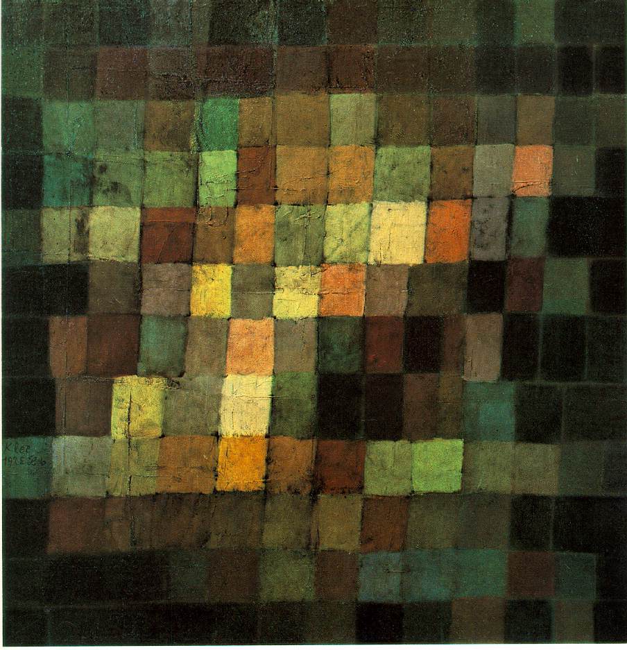
"Ancient Sound, Abstract On Black" 1925
http://www.sai.msu.su/wm/paint/auth/klee/klee.ancient-sound.jpg
This piece just cuts the dark in an unusual way with a tilted area/line of lightness, that contrasts the darkness. This contrast creates complexity. The lights and the darks mix, while all a similar range of hues. The greens turn to blacks, and the greens turns to browns then to yellows. Each block of color is rich, textures and hues. The organic-form of the grid is a human-element; it makes this piece easier to connect to. How can a person not connect to the imperfect, non-straight lines? This shows two things: that it was created by human, showing skill, and this shows a humanness that people connect to emotionally. And, the darkness almost creates a border; this shows control. This control is foiled/contrasted by the human-elements. The piece itself is done on a square canvas/paper/something; a square is perfect, all four sides the same, and people are attracted to perfect things. In effect, all of these techniques bring perfection and human-imperfections into one piece, so both parts can exhibit their "best" traits. This causes the viewer to be attracted to, and have an emotional response to this piece, because it is so human, and so perfect, and also well executed with its perfections and imperfections, so the viewer feels a complexity, including: attraction to perfection, attachment to the human-imperfections, comfort with the natural hues/colors, mix of emotions from either sight moving up or down (depending on if the viewer looks up or down the bright area/line), and the hues/colors themselves are rich that it grabs the viewer. I highly enjoy this piece. It does not feel pretentious, it does not have that cliche "human form" hidden in it; the piece feels understated, and I respect understatements. The piece is 15"15"; I'm not sure if I would prefer this as a smaller or bigger piece. My only criticism is that I'm not sure if some of the textures on the mid/top/left seems pretentious, otherwise, I wouldn't change anything.
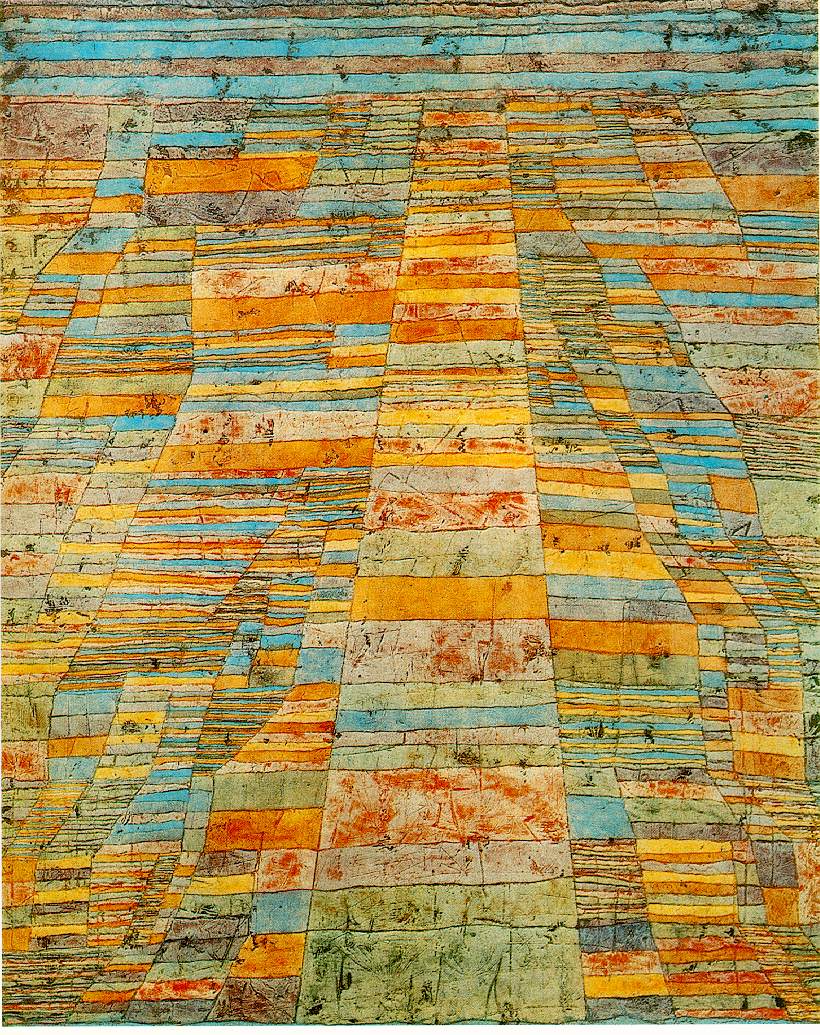
"Highway and Byways" 1929
http://www.sai.msu.su/wm/paint/auth/klee/klee.highway-byways.jpg
This piece is just pretty. I like to look at it. Again, there are human-imperfections, by the imperfect lines and coloring; this connects the viewer the piece. I feel that the dark splotches of colors (maybe where the canvas/something is dented) seems pretentious; I don't like that. I do not like things that intentionally creates imperfections (like French Country furniture with the white paint slightly sanded off). This type of intentional attempt at creating human-imperfections is dishonest. However, I don't know what Klee's intent was, and that isn't the point right now. The importance, is how the piece is to the me, the viewer, right now. I enjoy seeing those hues/colors; light-turquoise looks well with the reddish-orange, yellow, and opaque-green.. Also, the horizontal lines on the top give an unusual horizon-line. It looks tribal, human, with intents of design. It shoes rhythm (with the lines that the shapes form). The hues are fun and serious, or trust-worthy. It's not pretentious (except maybe the texture). I like this piece a little less than "Ancient Sound..."
"Primitive art, surrealism, cubism, and children's art all seem blended into his small-scale, delicate paintings, watercolors, and drawings." (Web Museum, Paris)
That is all that I want to say about Klee himself; his past childhood and adulthood do not interest me right now.
Meaning in art
There are two particular pieces of him that I enjoy. I don't think that the titles are too important, and I don't think that the factors that brought him to create these pieces are significant either. Being a "meaning" nihilist, I will take the perspective of no-meaning besides the physical piece of artworks themselves. The "meaning" behind these pieces are not important (right now). I do not like the little tags next to art that give/add significance to the piece; if the art is good enough, it doesn't need a paragraph to explain why it's special. For example, at a gallery showing John Lennon's artwork, I thought that the art took very little skill, I didn't think that they were good, but the little-pieces of paper next to each piece described the inspiration and meaning of the piece. Unless I'm considering the artist as a person, I don't care why an artist created a piece. Art has to be good enough to "stand on it's own", without the pointless labels that tell the viewer about the importance. Anyone can make up a meaning, but there are only a few pieces that are good enough as themselves.
I will critique two pieces by Paul Klee.
"Ancient Sound, Abstract On Black" 1925
http://www.sai.msu.su/wm/paint/auth/klee/klee.ancient-sound.jpg
This piece just cuts the dark in an unusual way with a tilted area/line of lightness, that contrasts the darkness. This contrast creates complexity. The lights and the darks mix, while all a similar range of hues. The greens turn to blacks, and the greens turns to browns then to yellows. Each block of color is rich, textures and hues. The organic-form of the grid is a human-element; it makes this piece easier to connect to. How can a person not connect to the imperfect, non-straight lines? This shows two things: that it was created by human, showing skill, and this shows a humanness that people connect to emotionally. And, the darkness almost creates a border; this shows control. This control is foiled/contrasted by the human-elements. The piece itself is done on a square canvas/paper/something; a square is perfect, all four sides the same, and people are attracted to perfect things. In effect, all of these techniques bring perfection and human-imperfections into one piece, so both parts can exhibit their "best" traits. This causes the viewer to be attracted to, and have an emotional response to this piece, because it is so human, and so perfect, and also well executed with its perfections and imperfections, so the viewer feels a complexity, including: attraction to perfection, attachment to the human-imperfections, comfort with the natural hues/colors, mix of emotions from either sight moving up or down (depending on if the viewer looks up or down the bright area/line), and the hues/colors themselves are rich that it grabs the viewer. I highly enjoy this piece. It does not feel pretentious, it does not have that cliche "human form" hidden in it; the piece feels understated, and I respect understatements. The piece is 15"15"; I'm not sure if I would prefer this as a smaller or bigger piece. My only criticism is that I'm not sure if some of the textures on the mid/top/left seems pretentious, otherwise, I wouldn't change anything.
"Highway and Byways" 1929
http://www.sai.msu.su/wm/paint/auth/klee/klee.highway-byways.jpg
This piece is just pretty. I like to look at it. Again, there are human-imperfections, by the imperfect lines and coloring; this connects the viewer the piece. I feel that the dark splotches of colors (maybe where the canvas/something is dented) seems pretentious; I don't like that. I do not like things that intentionally creates imperfections (like French Country furniture with the white paint slightly sanded off). This type of intentional attempt at creating human-imperfections is dishonest. However, I don't know what Klee's intent was, and that isn't the point right now. The importance, is how the piece is to the me, the viewer, right now. I enjoy seeing those hues/colors; light-turquoise looks well with the reddish-orange, yellow, and opaque-green.. Also, the horizontal lines on the top give an unusual horizon-line. It looks tribal, human, with intents of design. It shoes rhythm (with the lines that the shapes form). The hues are fun and serious, or trust-worthy. It's not pretentious (except maybe the texture). I like this piece a little less than "Ancient Sound..."
01 May 2012
Housing, Prepare IB Exam
I sent in the form for Smith Hall yesterday.
http://inside.massart.edu/Documents/inside.massart.edu/campus_life/Smith%20Hall%20Facilities%20and%20Floorplans(1).pdf
My first IB exam occurs tomorrow. It is for English, and it will be a "blind passage".
My schedule is busy, as there are IB exams and graduation events to fulfill. I will continue to work; this changes the pace of things, and it changing the type of thinking that I usually have.
I hope to leave Taiwan as soon as possible, but I'm not sure if I have to take any KHS final exams. If I do, Taiwan will have to be delayed. If not, I can leave on 12June.
Subscribe to:
Comments (Atom)